
_Optimized.webp?width=3000&name=Boundless100_Lookbook%20(1)_Optimized.webp)


.jpg?width=300&name=mail%20(14).jpg)
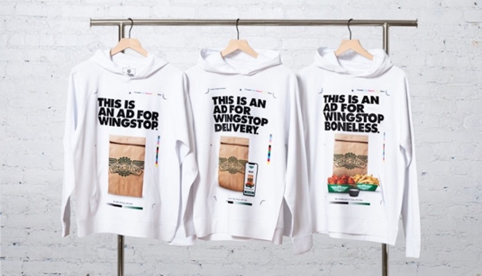
Promotional products are an effective marketing tool with a lot of staying power. Combined with solid color psychology and creative product choices, promo can turn even more heads and boost results for your business.
Choosing the right product is an art in itself, but once you’ve made your selection, you’ll have to make yet another tough choice: choosing the right color. We know that color trends matter in marketing, and this year’s trends are no different.
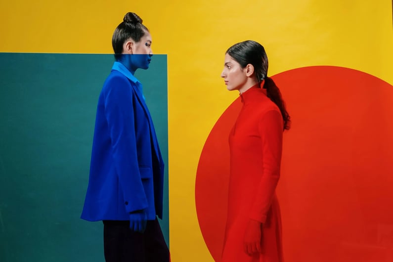
Have you ever watched a Wes Anderson film? Movies like The Grand Budapest Hotel or his newest creation, Asteroid City, are perfect examples of how bold color choices turn more heads. In fact, Wes Anderson’s style recently took TikTok by storm, so the public clearly loves bold hues right now.
In the meantime, these bright, bold colors are coming back to promotional products. Everything from neon yellow sunglasses to bright red leatherbound notebooks is turning heads this season—but why?
Let’s look at why consumers are clamoring for brightly-colored promotional products right now, plus tips to help your brand take full advantage of this color trend.
What’s the deal with bright colors?
Promotional products give you the power to engage with your audience one-on-one in real life. These opportunities for connection are powerful in an era of digital-first marketing, which is why promotional products can be so persuasive.
You’re in the business of persuasion, after all, so it’s important to recognize how bright colors affect consumers. Since 93% of consumers say color is the top factor influencing their purchasing decisions, promo color choice matters.
Consumers want to see bright colors this year, but some brands aren’t sold on electric blue promotional products. It might feel like a bold choice, but bright colors are popular for several reasons.
Bright colors elevate moods
People tend to gravitate toward bright, happy colors. In fact, research shows that people feel happier when they wear bright colors, so bright hues can directly impact your audience’s emotional state.
Bright colors produce endorphins, which naturally make us feel more happy. Positive brand interactions are a must-have to Create Brand Love™ moments with your audience, and the endorphins produced by bright colors could set the tone for better audience interactions.
Bright colors draw the human eye
The eye pays more attention to bright colors than muted colors. In fact, the eye is psychologically wired to prefer brightly saturated colors over pastel colors. It’s the reason why you highlight important text with a neon yellow highlighter instead of a pastel pink highlighter.
In promo campaigns, opting for bolder colors encourages people to pay more attention. For example, a lime green plushie is much more noticeable than a white plushie on a crowded expo hall floor.
Bright colors are distinctive
It seems like every bank in the world uses some version of blue, white, and gray as their color scheme, and that’s for a good reason. These colors connote trustworthiness, innovation, and intelligence.
The downside to choosing popular colors is that other companies in the same space might use a similar palette. In practice, this means your brand is blending into the background—literally.
Bright colors, on the other hand, go against the grain. They make it very apparent that you’re different from everyone else in your industry. Since color increases brand recognition by 80%, choosing a different palette will make your business more unique and distinctive. (You’ll also stand out on a crowded tradeshow floor—win-win!)

4 tips for using bright colors in promo campaigns
Consider how you can evoke the right emotions with your next campaign: Build a vibe with a really intentional color palette. Follow these four hacks to leverage bright colors in your next promotional product campaign.
1. Choose the right bright hue
Statistically speaking, people gravitate towards red, blue, and green the most. Using brighter varieties of these colors is a great way to balance your audience’s tastes with an out-of-the-box approach.
Start your color — and shade — choices by considering your audience. GenZ, for instance, loves bright colors, while GenXers prefer something a little more neutral.
But tread carefully here. Bright red is fun, but in the wrong context, it can have connotations of aggression or violence. The design context of the product’s color matters, so always request product samples in your selected shade before ordering 400 units.
You must also consider how well the bright hue matches your company’s brand or personality. Maybe bright electric blue makes sense for your promotional products, but neon pink would just look silly. Only you can make the call on which hues work best for your brand and target audience.
2. Combine colors
Wes Anderson’s distinct style combines together bold colors, like pink and green. That might normally be considered a fashion faux pas, but somehow, it works!
If you want to turn more heads, take a page out of Wes Anderson’s book. Sometimes a single color won’t tell a complete story, but bold color combinations encourage more people to engage. Bright pink and baby blue, teal and goldenrod, and royal purple and fire engine red are all bold pairings that, treated well, are much more intriguing than a single color.
If you don’t want to make such a loud statement, consider combining a bold color with a more muted tone. For example, electric orange goes well with gray because the gray tones down the visual intensity of the orange. The orange adds just enough intrigue to the product without overwhelming your senses.
When in doubt, work with a graphic designer to pick the right color combination. Make sure to request a proof of the product in your chosen color scheme, so you can see what it looks like in your hand.
3. Opt for color-changing products
Who says you have to settle for just one color? Temperature- and heat-sensitive mugs, cups, and jewelry give you the power to include multiple bright colors in your promotional products.
Nineties nostalgia is at an all-time high, and choosing color-changing products is another creative way to leverage this trend in your promotional products.
4. Pair cool colors with quirky products
If you’re choosing cool colors, choose equally interesting products. Try products like:
- Custom sneakers
- Sunglasses (because the colors are bright—get it?)
- Pool floaties
- Candy jars, complete with color-coordinated candy
- Kites
Of course, you’ll also want to go for goods that are both useful, unusual, and crave-worthy.

Unleash the power of color
Bright colors say you’re fun, different, and willing to think outside the box. While muted color palettes were popular in the past, now is the time to ditch these palettes for something bigger and bolder. Following the tips in this guide will help you combine the one-two punch of promotional products with bright colors.
When you need more hands-on help, chat with Boundless’s team of promo experts. We help brands source the right products in the perfect hues that instantly Cultivate Brand Love™. See how Boundless unlocks your brand’s potential.