
_Optimized.webp?width=3000&name=Boundless100_Lookbook%20(1)_Optimized.webp)


Did you know that the human eye can see one million colors? Color gives context, beauty, and meaning to our lives.
But like anything, colors tend to come and go with the times. It’s the reason why we associate the ‘80s with funky shades of neon and the ‘60s with hues of brown and orange.
Whether you notice it or not, colors give off a particular vibe that’s tied to a place, time, or memory. It’s inherently emotional, which means it’s surprisingly important for promotional product campaigns.
Get ready to color your world. Let’s dive into why color matters for promotional products, as well as five color trends you should use for 2022.
Why does color matter?
So, why do we care about color in marketing? Can’t you just make everything blue, gray, and white and call it a day?
Well, you could, but you might be missing a vital opportunity to capitalize on hues that can connect to your audience in a universally relevant way. While core color consistency is definitely important for a brand, infusing some trending colors can tap into a collective, emotional aspect that's as exciting as it is timely. Each color gives off a specific vibe, so your team should choose a color that matches your campaign goals.
Color matters for a slew of other reasons, too:
- It’s persuasive: Colors communicate on a subconscious, emotional level. That’s why drug manufacturers intentionally make sleeping pills blue—we associate blue with serenity and calm. It’s important to use a color for your products that matches the end goal for the consumer. If you’re an energy drink brand, go with energizing orange. If you’re a baby brand, go with calming (and gender-neutral) mint green.
- Shoppers care about aesthetics: There’s a reason why Instagram is so popular: people care about how things look! In fact, 93% of shoppers rate visual appeal as the most critical factor for choosing products off the shelf. And 85% say color is the primary reason they buy certain products, too.
- Color attracts specific audience segments: Did you know that product color choice can influence certain consumers? Shoppers on a budget tend to go for navy blue or teal, while impulsive shoppers usually go for red or black. Men tend to prefer bolder colors, while women prefer softer colors. This means that, as long as you know your audience demographics, you can choose colors that attract the right people to your business.
- Color affects brand recognition: Color increases brand recognition by 80%. The right color shows off your brand’s personality, but it also hard-wires your customers’ brains to associate that color with your brand. It’s the reason why Target’s red bulls-eye is so iconic!
5 color trends for promo products in 2022
Ready to paint the town red (or Very Peri)? Make 2022 your year by incorporating these five color trends into your branded merchandise.
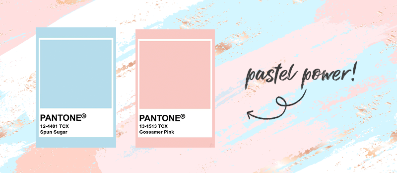
1. Pastels
The ‘90s are back in the form of pastels. In 2022, consumers have been through nearly two years of uncertainty and tension, from public health to socioeconomic stress. The soothing effect of pastel colors is in demand right now, but with a twist.
Use pastel colors in pink or blue to give your promotional products a little bit of an edge. We recommend Pantone 12-4401 (Spun Sugar) and Pantone 13-1513 (Gossamer Pink) for this trend.
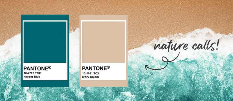
2. Muted earth tones
Like pastels, muted earth tones give off a vibe of comfort and serenity by referencing colors found in nature. For thousands of people living and working from home in small apartments, earth tones are a great way to tap into the back-to-nature vibe that consumers find refreshing.
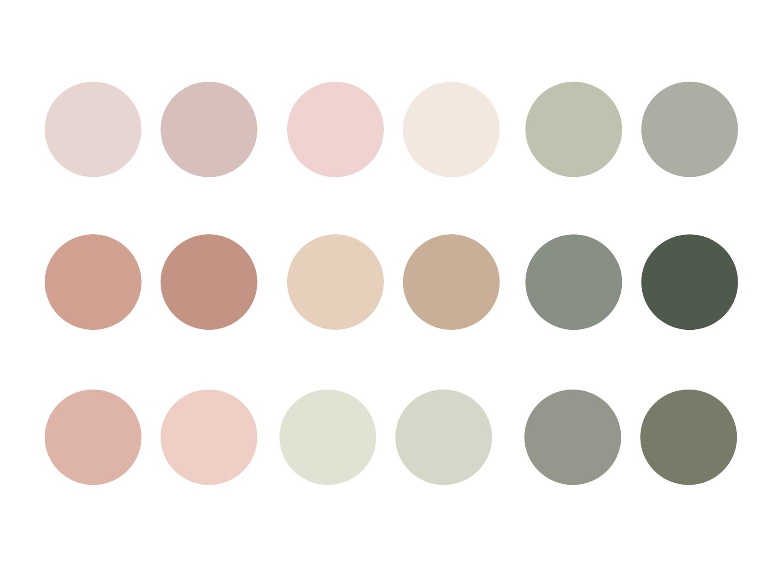
Keep in mind that we’re talking about muted earth tones here. So, if you have a really big, bold brand, muted tones can bring a sense of balance and zen. Make sure your brand is ready for this energy shift when you use these colors in your promotional campaigns. It might be a great fit for a wellness program or Earth Day care package for your employees!
Not sure which colors qualify? We’re voting for Pantone 18-4728 (Harbor Blue) and Pantone 13-1011 TCX (Ivory Cream).
3. Vintage palettes
TikTok and Gen Z have brought back vintage palettes by force—and we love it! Regardless of the decade, vintage color choices are popular with younger consumers.
If you want groovy, ‘70s-inspired products, go for floral, muted colors. The look is old-school and earthy comfort. Try Pantone 16-5907 (Granite Green) or Pantone 14-0626 (Dried Moss) to hit this color trend.
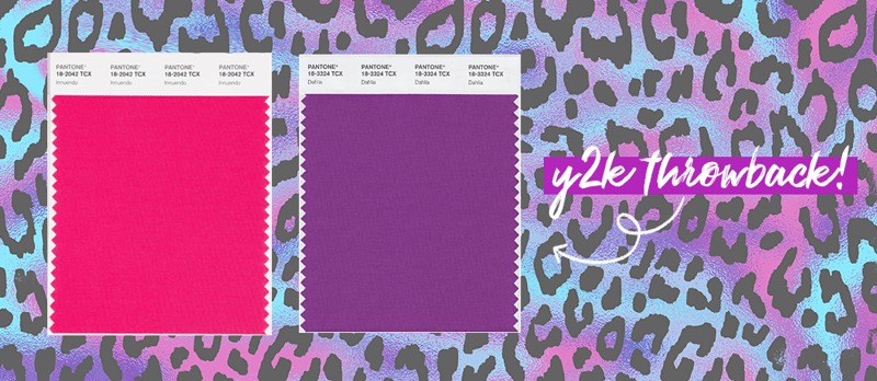
Maybe you want to tap into something a little more ‘80s? This color trend evokes nostalgia, largely for consumers who are ages 40+. Use Pantone 18-2042 (Innuendo) or Pantone 18-3324 (Dahlia) to give consumers the throwback, Lisa Frank-esque colors they crave.
Hint: We love Y2K-inspired nostalgia and color trends. Explore it further in our 2022 Trending Lookbook!
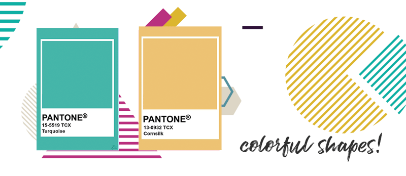
4. Quirky shapes
Colors are about a lot more than hues—in fact, most promotional products can be decorated with two tones or a pattern to bring the boldness. Whether it’s gym bags, T-shirts, or fountain pens, you can jazz up your branded swag with vibrant full-color patterns.
This year, quirky shapes are in. Consumers are looking for fun, abstract designs that grab their attention. Feel free to put more powerful, saturated colors up against each other to really make a splash, too. Pantone 13-0932 (Cornsilk) and Pantone 15-5519 (Turquoise) is a fun combination below.
5. High saturation
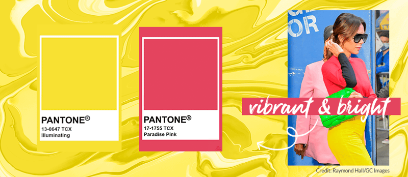
While most of the 2022 color trends involve a muted color palette (bring on the calm!), some folks prefer the complete opposite. They want to live a little after a few rough years, which means some consumers want to see rich tones that are deeply saturated.
Yes, it’s definitely going to assert, “Look at me!” but why is that a bad thing? When you need to capture hearts quickly, sometimes a high-saturation color will do the job. Try unusual combinations like Pantone 13-0647 (Illuminating) and Pantone 17-1755 (Paradise Pink). If the high-saturation colors look like they’re a bit much, you can always combine them with a more neutral tone to make it look energetic yet professional.
Want to see more color trends? We highlighted four color collections in the 2022 Trending Lookbook and created this fun resource to help you infuse them into your brand palettes.
2022: The year of color
Color is often treated as an afterthought, but it can have huge ramifications on your promotional products’ effectiveness. You need every ounce of ROI you can get, so when in doubt, follow these five color trends to stay on the cutting edge in 2022.
Not sure which trend will work best for your promotional products? That’s where we come in. Boundless helps brands foster more Brand Love through the power of promotional products. See how Boundless can make your brand bigger and better in 2022.